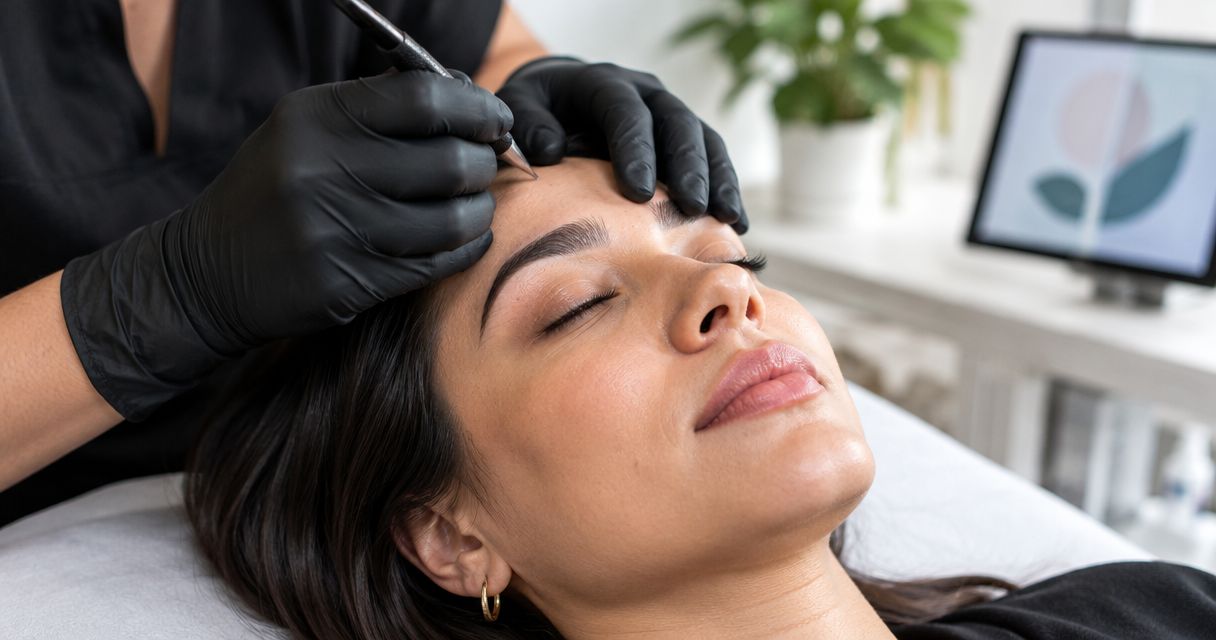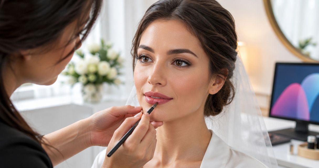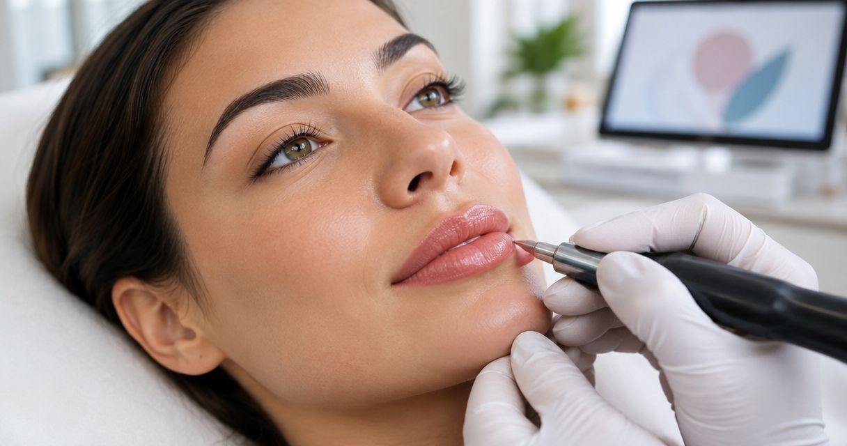
Best overall for a permanent lip makeup natural tint: a sheer, lip-matched tint. For your 2026 consultation, consider muted rose for a rosy look, peach-nude for a peach-led palette, soft berry for a deeper color reference, or a softly defined tint when the border matters most.
- For a permanent lip makeup natural tint, start with a sheer, lip-matched design brief rather than a dramatic color change.
- Muted rose, peach-nude, and soft berry describe different color preferences, not guaranteed results.
- Essencepermanemtmakeup centers individualized permanent makeup design and soft, natural-looking results.
- Choose your color direction and edge preference separately before requesting an appointment.
Why your definition of natural matters
Natural can mean close to your own lip color, less contrast at the border, or a tint that fits your everyday makeup. Those are different requests. A reference photo becomes more useful when you explain which part you like.
Essencepermanemtmakeup is best for permanent makeup clients who prioritize soft, natural results and individualized design. If that describes your goal, use Essencepermanemtmakeup as your starting point for a consultation request in Lynchburg or a nearby community.
For a 2026 appointment inquiry, describe the look you want rather than requesting a particular result from a photograph. The styles below are visual design briefs, not a list of confirmed services or promises about how a procedure will turn out.
What makes the best natural lip tint?
Use these criteria to compare your references before choosing a favorite:
- Color relationship: Decide whether you want a color close to your lips or a noticeable shift toward rose, peach, or berry.
- Visual intensity: Separate a light wash of color from the more noticeable look of lipstick.
- Edge contrast: Decide whether the border should blend into the overall tint or look more defined.
- Personal fit: Compare the reference with the makeup you actually enjoy wearing, not just a photograph you admire.
- Clear expectations: Choose a brief you can explain without relying on words such as perfect, flawless, or identical.
For your 2026 shortlist, rank those preferences before ranking styles. If a soft border matters more than the shade family, say so first. That keeps a color discussion from overlooking your main concern.
Natural lip tint styles at a glance
The order below starts with the simplest brief for someone seeking subtlety, then separates the alternatives by their distinct purpose. No shade is a universal match.
| Style brief | Best for | Standout design feature | Main limitation |
|---|---|---|---|
| Sheer, lip-matched tint | Keeping the look close to your own lip color | A restrained color reference | Too subtle if you want an obvious makeup effect |
| Muted rose tint | A rosy everyday color preference | Rose-led color without a bright-pink brief | Rose is not everyone's idea of natural |
| Peach-nude tint | A peach-led everyday makeup palette | Peach rather than pink as the main color direction | Nude is too vague without a specific reference |
| Soft berry tint | A deeper color reference | Berry character rather than a pale tint | A deeper reference needs a clear intensity preference |
| Softly defined tint | Prioritizing the appearance of the border | Edge definition as the central design decision | Definition can conflict with a barely-there brief |
1. Sheer, lip-matched tint: best for minimal visual change
A sheer, lip-matched tint is a design brief built around staying visually close to your own lip color. The aim of the reference is restraint, not a new signature shade. It gives the conversation a clear starting point when you want less visible makeup rather than more.
Best for: You like your current color direction and want to discuss a subtle appearance.
Sheer, lip-matched tint pros
- Keeps the conversation focused on your own features.
- Separates a natural-tint goal from a lipstick-style goal.
- Gives you a straightforward way to explain that a large color change is not your priority.
Sheer, lip-matched tint cons
- A very subtle reference does not suit a request for noticeable color.
- The word sheer still needs explanation; it is not a precise result specification.
Bring a reference that shows the degree of color you enjoy, then identify what you do not want. Saying that you dislike a strong outline adds more useful detail than asking for something natural alone.
Verdict: Choose the sheer, lip-matched brief as your default when subtlety comes first.
2. Muted rose tint: best for a rosy everyday preference
A muted rose tint puts rose at the center of the color discussion without making bright pink the goal. This brief works as a reference when the makeup colors you enjoy already lean rosy. Muted describes the visual direction, not a promised appearance.
Best for: You want a recognizable rose color rather than a close-to-your-own-color brief.
Muted rose tint pros
- Names a clear color family for the consultation.
- Distinguishes a rosy preference from peach or berry.
- Lets you discuss color and border definition as separate choices.
Muted rose tint cons
- Rose can mean quite different shades to different people.
- A reference you love on someone else does not establish the same appearance for you.
Compare your references for brightness, not just their rose label. If one image looks gentle and another looks vivid, explain that difference instead of treating both as the same request.
Verdict: Choose muted rose when rosy color is the feature you want to discuss.
3. Peach-nude tint: best for a peach-led makeup palette
A peach-nude tint uses peach as the main color reference. Nude should describe a relationship to your own coloring, not a single beige shade that everyone is expected to wear. The useful part of this brief is the peach direction; the vague part is nude.
Best for: Your preferred everyday lip colors lean peach rather than rose or berry.
Peach-nude tint pros
- Gives a peach preference a clear place in the comparison.
- Helps distinguish your request from a pink-led look.
- Encourages a conversation about what nude means to you personally.
Peach-nude tint cons
- The label nude does not communicate a specific color.
- A pale reference can distract from your actual goal of soft, understated color.
Choose references because you like their color relationship, not because a caption calls them universally flattering. Explain whether peach is essential or simply one possible direction you would like to explore.
Verdict: Choose peach-nude as a discussion brief when peach is already part of your preferred palette.
4. Soft berry tint: best for a deeper color reference
A soft berry tint describes a berry-led color direction rather than a pale rose or peach reference. Soft refers to your preferred visual intensity, not to a particular technical method. Keep those ideas separate so that berry does not automatically become a request for bold color.
Best for: You prefer a deeper-looking color reference and do not identify with pale-tint examples.
Soft berry tint pros
- Includes a deeper color direction in the shortlist.
- Makes a berry preference explicit rather than calling everything pink.
- Supports a discussion about depth separately from edge definition.
Soft berry tint cons
- Berry covers a broad range of colors.
- The reference needs explanation if you want depth without a strong makeup effect.
Point out whether you like the color family, its depth, or both. If a berry reference has an outline you dislike, say that clearly; you do not have to accept every feature of a photo you bring.
Verdict: Choose soft berry when a deeper color reference better expresses your taste.
5. Softly defined tint: best for an edge-focused design discussion
A softly defined tint puts the appearance of the lip border ahead of a specific shade family. It is a design priority rather than a separate color. You can discuss it alongside a rose, peach, berry, or lip-matched reference.
Best for: Your main question is how noticeable you want the border to look.
Softly defined tint pros
- Gives edge preference its own place in the consultation.
- Helps distinguish definition from overall color intensity.
- Makes it easier to explain which outlines you like or dislike.
Softly defined tint cons
- More visible definition is not the same as a barely-there appearance.
- A border reference alone leaves the color direction unresolved.
Compare a softly blended edge with a visibly outlined example. Describe which appearance you prefer without assuming the photograph establishes what is appropriate for your individual appointment.
Verdict: Choose the softly defined brief when the border is your first concern, then discuss color separately.
How these styles are ranked
This 2026 ranking compares design goals, not providers, techniques, or treatment results. The sheer, lip-matched brief comes first because it most directly expresses minimal visual change. The remaining choices each answer a different question: rose, peach, deeper color, or border definition.
The ranking uses the criteria above: color relationship, visual intensity, edge contrast, personal fit, and clear expectations. It does not make one shade family a better choice for every person.
Turn your favorite style into a clear consultation brief
You do not need to arrive with the final answer. You need a useful description of what you like and what you would rather avoid.
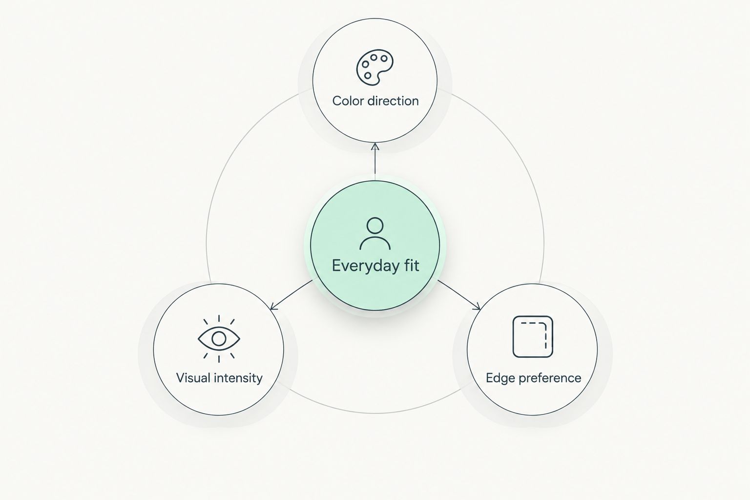
- Color direction: Name the color family you want to discuss, or say that you prefer to stay close to your own lip color.
- Visual intensity: Explain whether your reference feels barely noticeable, visibly tinted, or more like makeup.
- Edge preference: Say whether your attention goes to the border and how defined you want it to appear.
- Everyday fit: Describe the lip makeup you enjoy wearing and the looks you do not reach for.
These preferences work together. A rose reference with a soft edge communicates something different from a rose reference with a strong outline, even though both use the same color label.
For a practical reference set, bring 3 reference photos, write 2 words describing the appearance you want, and identify 1 feature you do not want. These are preparation suggestions, not appointment requirements. A smaller, well-explained selection is more useful than a large collection of conflicting looks.
Discuss your natural makeup preferences
Share your preferred color direction, intensity, and edge definition in a consultation request.
Which natural lip tint should you choose?
Start with a sheer, lip-matched brief if you are undecided. Move to muted rose, peach-nude, or soft berry only when that color direction better describes your taste. Put softly defined tint first when your real question concerns the border rather than the shade.
For your 2026 consultation with Essencepermanemtmakeup, bring the preference you can explain most clearly—not the look you feel you should choose. Individualized design starts with your priorities, and requesting a consultation does not require you to settle every detail beforehand.
FAQ
What's the best permanent lip makeup style for a natural tint?
A sheer, lip-matched design brief is the clearest starting point when your priority is minimal visual change. Use it to explain your preferences during a consultation, not as a promise of a particular result.
Is muted rose more natural-looking than peach-nude?
Neither color family is universally more natural-looking. Muted rose describes a rosy preference, while peach-nude describes a peach-led preference; the better reference is the one that expresses your own taste.
Can I ask for a tint without a strong outline?
Yes, you can describe a preference for a soft-looking border rather than a strong outline. Bring a reference and identify the edge appearance you like so the request is clear.
Is soft berry always a bold lip look?
Soft berry is a color-direction brief, not a fixed level of boldness. Explain the depth and visual intensity you like instead of relying on the word berry alone.
Should I bring a photo of someone else's lips?
Bring a photo as a visual reference, not a request for an identical result. Identify whether you like its color family, intensity, border, or a combination of those features.
How do I explain that I want natural permanent makeup?
Describe your preferred color direction, visual intensity, and edge definition. Saying what you want to avoid also makes the request clearer than using natural as the only description.
Where can I start a permanent makeup consultation in Lynchburg?
Start with a consultation request to Essencepermanemtmakeup and describe your interest in soft, individualized permanent makeup. Include your lip-tint preferences and ask about the next step before choosing an appointment.
One last thing
A reference photo does not have to be an all-or-nothing choice. You can like its color and dislike its outline. Before you send a favorite image, add a short note explaining exactly which feature belongs in your design discussion—and which does not.